Effective Visual Information Architecture
Communicating the purpose, vision, and services of the organization through intuitive content organization for the target audience.
User Experience Research, Analysis, and Application
Assessment of competitor and other reference product characteristics, both valuable and flawed, aggregated and synthesized into a comprehensive final product.
Accessible and Contemporary Design
Iterative development toward a responsive and modern design through prioritizing user experience from user feedback.
Competitor Audit
Our team evaluated the experience, processes, features, content, and aesthetics of similar organizations for both reference and inspiration that guided the design process. This provided a foundation for how to visually organize and structure the information and ideas.
Client Interview
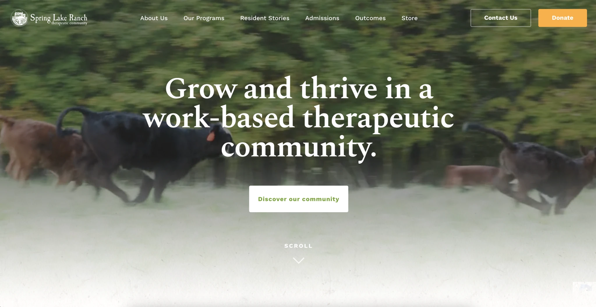
To understand the user needs, speaking with the client directly we defined and discussed the client’s vision and ultimate purpose for the project. We developed our priority functions and design direction based on our client’s feedback. In my design contributions, I attempted to keep the same visual aesthetic of the client’s current website for brand consistency.

User Persona
To anticipate and understand the needs of an actual user for this service, our team fabricated a hypothetical user and considered their characteristics to orient the experience.

Sketches to Visualize User Functions
Before committing to any design, we produced some quick sketches of the general flow of the primary functions for the website. These provided us the foundation for what is necessary to include.

Figma Low-Fidelity Prototype
We further developed our flows into actual functional designs in Figma. This was the beginning of our information organization and establishing a certain experience for the website.

Wix High-Fidelity Prototype
The prototype advanced into an actual website using the basic function created in the sketches. The aesthetic, content presentation, and content organization became bigger considerations to the design but were largely experimental.

Feedback through Presentation and Testing
We brought our initial prototypes to our classmates for feedback to address any blindspots and receive foresight. Engaging with an audience enabled us to get a better understanding of the perceived experience and ideas for improvement.

Final High-Fidelity Prototype
By applying all of our feedback to our ideas and combining them with the initial information we collected from the beginning of the project, the final prototype was created. It reflects the more effective organization and flow based on our testing and cross-evaluation.

Logo Design
I designed a logo for our client, using many of the different traits of the organization. The location of the Cheyenne Mountains was important to the experience, so I integrated both mountains and a shape similar to the Colorado logo. The multiple buffalo represent the collective herd approach of the organization.

Client Final Meeting and Presentation
With completed deliverables, we met and presented our work to the client. We explained our processes and intentions and provided recommendations going forward.

UX Design Principles · TCID 3865 Spring 2024
High-Fidelity Prototype Client Presentation · Client: “The Collective” · Team Members: Samantha Rivas, Nikita Wong, Tobias Estrella